Power BI Sales Dashboard
Interactive sales dashboard built in Power BI, visualizing KPIs and trends for business insights.
Data Analyst — SQL · Tableau · Power BI · Excel
I transform raw, chaotic data into actionable insights that drive business growth.
From building dynamic KPI dashboards to uncovering trends with SQL, I deliver clarity
and impact through Tableau, Power BI, and Excel.
Let’s turn
your data into a compelling story that inspires action!
Interactive sales dashboard built in Power BI, visualizing KPIs and trends for business insights.
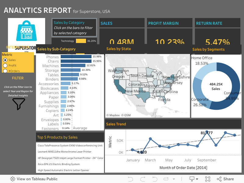
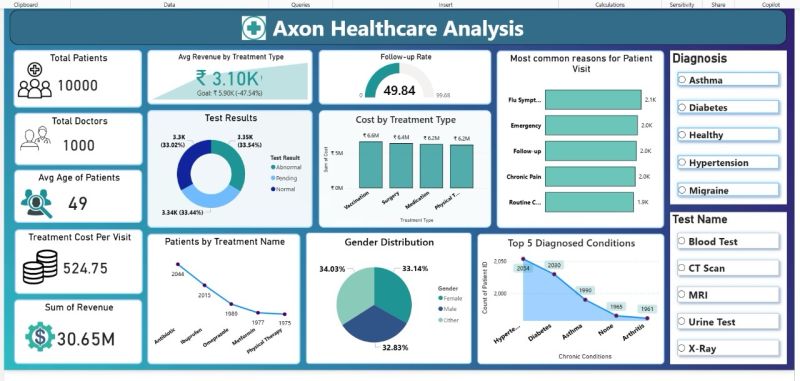
Tableau dashboard showcasing assignment analytics and interactive data exploration.
Open in Tableau Public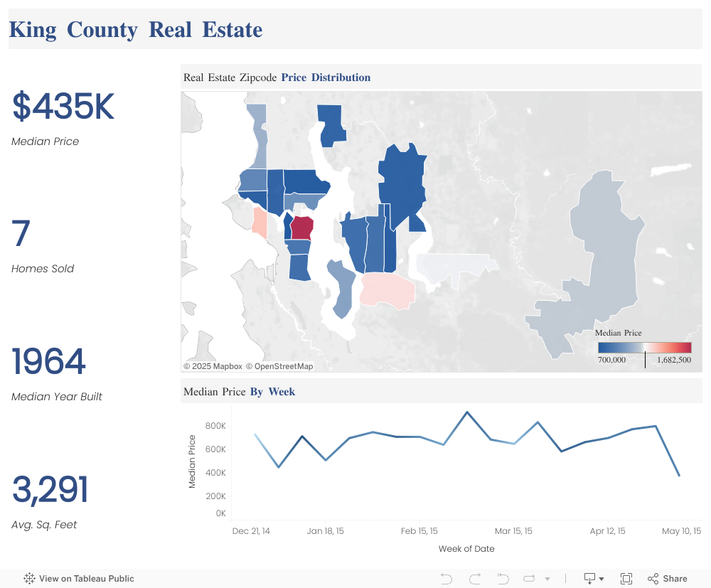
Interactive Tableau dashboard analyzing King County real estate data for trends and insights.
Open in Tableau PublicData Analytics Certification Program — ExcelR (Issued Jun 2025)
Email: mridu.gurudwan@gmail.com
LinkedIn: mridu-krishna-gurudwan
“Garbage in, garbage out.” Clean data drives accurate insights, trusted decisions, and faster analysis…
Ranking, running totals, moving averages—learn the window patterns I use to turn raw tables into insight…
A simple framework to pick the right KPIs, declutter visuals, and ship dashboards that drive action…
From VLOOKUP alternatives to dynamic arrays—unlock Excel's hidden power for faster, cleaner analysis…
Posted by Mridu Krishna Gurudwan
When it comes to data analysis, the phrase “garbage in, garbage out” couldn’t be more true. No matter how advanced your analytics tools or how sophisticated your models, if your data is messy, your insights will be unreliable. That’s why data cleaning is the unsung hero of every successful data project.
Data cleaning (or data cleansing) is the process of identifying and correcting (or removing) errors and inconsistencies in data to improve its quality. This step is essential before any meaningful analysis, visualization, or machine learning can take place.
TRIM,
CLEAN, Remove Duplicates.
.dropna(), .fillna(),
.duplicated(), .astype().
Remember: Clean data isn’t a chore—it’s a competitive advantage.
Want to see it in action? Check out my Power BI and Tableau dashboards.
Posted by Mridu Krishna Gurudwan
Window functions let you compute metrics across related rows without collapsing them. Here are the patterns I use most in analytics work.
-- Example sales table
-- sales(order_id, order_date, customer_id, region, amount)
SELECT
  order_date,
  amount,
  SUM(amount) OVER (ORDER BY order_date
                    ROWS BETWEEN UNBOUNDED PRECEDING AND CURRENT ROW) AS running_sales
FROM sales;
SELECT
  customer_id,
  SUM(amount) AS total_spend,
  DENSE_RANK() OVER (ORDER BY SUM(amount) DESC) AS spend_rank
FROM sales
GROUP BY customer_id;
SELECT
  region,
  order_date,
  amount,
  SUM(amount) OVER (PARTITION BY region ORDER BY order_date) AS running_region_sales
FROM sales;
SELECT
  order_date,
  amount,
  AVG(amount) OVER (ORDER BY order_date
                    ROWS BETWEEN 6 PRECEDING AND CURRENT ROW) AS ma_7d
FROM daily_sales;
WITH daily AS (
  SELECT order_date, SUM(amount) AS sales
  FROM sales
  GROUP BY order_date
)
SELECT
  order_date,
  sales,
  LAG(sales, 1) OVER (ORDER BY order_date) AS prev_sales,
  ROUND(100.0 * (sales - LAG(sales,1) OVER (ORDER BY order_date))
        / NULLIF(LAG(sales,1) OVER (ORDER BY order_date),0), 2) AS growth_pct
FROM daily;
PARTITION BY to compute per-segment metrics without extra joins.NULLIF(x,0) to avoid division by zero.Posted by Mridu Krishna Gurudwan
The best dashboards answer three questions fast: Where are we? Why? What next? Here’s my simple approach to build dashboards that drive action.
I apply this framework in my Power BI and Tableau projects to make sure the dashboards don’t just look good—they change behavior.
Posted by Mridu Krishna Gurudwan
Excel isn't just spreadsheets—it's a powerhouse for data analysis when you know the right tricks. Here are 5 techniques I use daily to work faster and smarter.
XLOOKUP is more flexible, doesn't break when you insert columns, and can search
left/right/up/down.
=XLOOKUP(lookup_value, lookup_array, return_array, [if_not_found], [match_mode])
Stop manual copy-paste. Use Get & Transform Data (Power Query) to automate cleaning, merging, and reshaping.
Modern Excel's FILTER(), SORT(), and UNIQUE() replace
complex formulas with one-liners.
=FILTER(A2:C100, B2:B100="Active", "No results")
Highlight outliers, trends, or thresholds instantly. Use Data Bars, Color Scales, or custom rules.
Ctrl + T: Convert range to Table (auto-filters, expandable)Ctrl + Shift + L: Toggle filtersAlt + =: AutoSumF4: Toggle absolute/relative referencesPro tip: Mastering Excel isn't about memorizing every function—it's about knowing which tool solves your problem fastest.
Want more? Check out my Power BI dashboards where I combine Excel data with advanced visualizations.